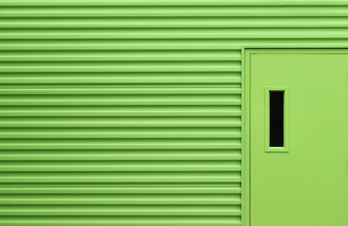
Tips for Minimalist Photography in an Urban Environment
Minimalism gained popularity in America in the 1960s with links to the Japanese traditional culture of Zen Philosophy. As a reaction against the whims of abstract expressionism, artists like Sol LeWitt, Frank Stella, and Mark Rothko experimented with stripped back processes and imagery, exposing the bare bones of visual art.
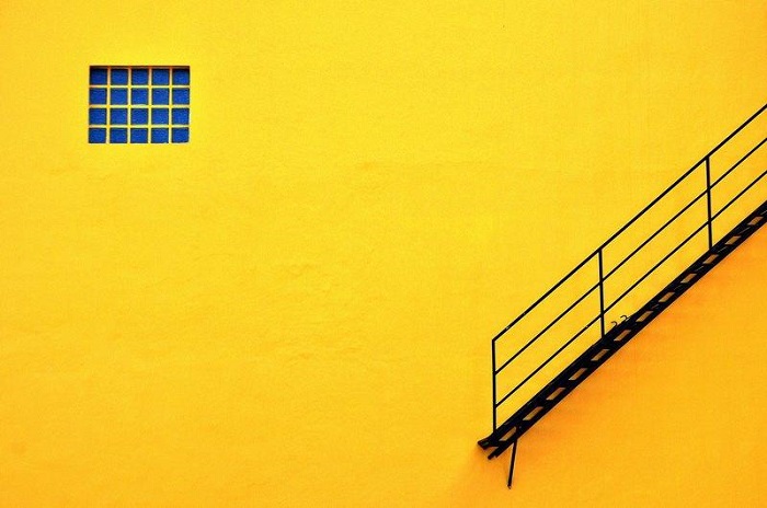 The history of the minimalist photography movement isn’t dissimilar to that of their contemporaries. The scientific photography of Bernice Abbott is referred to as a marked pivot towards minimalism. Photographers like Robert Adams and Lewis Baltz also used reductionist techniques to explore composition in the natural and urban landscape.
Like all visual art, minimalism is founded on the basic elements of design; line, shape, color, texture, form, and composition. The scope of interpretation within minimalist art is vast, with its proponents yielding a diversity of results and reasoning. However, minimalist art can be surmised within a single principle, the old utterance of «keep it simple».
Photograph the simplicity of the surrounding world
Minimalism is about how little you can say without compromising meaning. Minimalist photography is a great opportunity to slow down and reevaluate your photographic process. Before taking a shot, take a breath and think about your desired outcome. How does your knowledge of composition apply to the subject at hand? How would you like to approach exposure? Minimalism is a very meditative process, sort of like yoga, but for your photography.
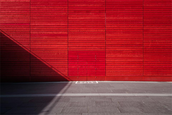 Minimalist photography in an urban landscape
Often, the practical components that make up an urban landscape are the same that serve as the best minimalist subjects. Minimalist depictions of nature tend to rely on the soft flow of organic structures. However, urban minimalist photography capitalizes on the bold lines of old buildings, fresh apartments, and upturned car parks.
Intermixed with bolts of color, texture, and juxtaposition, minimalist photography can be both subtle and loud at the same time. Photographers of minimalism capitalize on strong, stripped back elements to create both subtle and high-impact imagery. That is why moving forward in minimalist photography often requires you to steep yourself in the very basics of composition in photography first.
Rule of thirds
The rule of thirds is a trick to help determine the overall composition of a photograph. Mentally divide an image up evenly into thirds both horizontally and vertically. The lines that intersect around the central rectangle indicate the points that capture the majority of a viewer’s attention. By offsetting important points in a photograph from the center rectangle, an image will feel more naturally appealing to your audience.
Minimalist photography relies equally on what has been included and excluded from an image. Composing a visually harmonious photograph with tools like the rule of thirds maximizes the short time a viewer has to engage with a photograph.
 This photo is sectioned off into 9 even rectangles. The four central intersecting points indicate the focal points of the photograph.
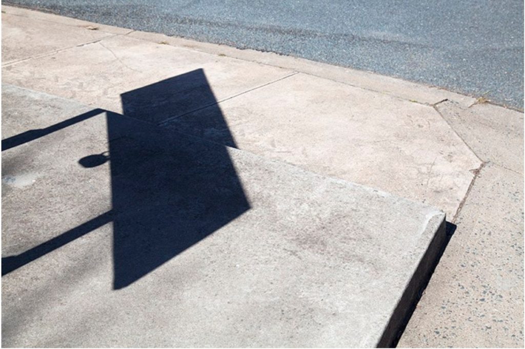 This photo is an example of the rule-of-thirds in practice. No single component of the photograph lies directly within the center, guiding the viewer’s eye around the image rather directly to the center.
Colors
Color has a language that establishes the atmosphere and emotional range of an photo. Where traditional black and white highlights the form of an image, two or three highly contrasting colors can bring the facade of the urban environment to life.
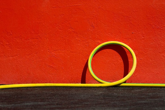 Solid of color convey vitality and hardness in an image, whereas a gradient is softer and more accommodating. Pastel color schemes depicted by many contemporary minimalist photographers deliver a surreal, dream-like quality to a photograph, while also alluding to childhood, disassociation and new-media aesthetics.
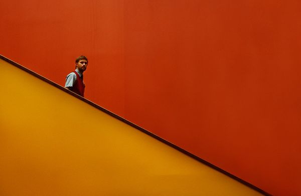
Isolated colors can add depth to an image and draw attention to details often overlooked in the urban landscape.
Lines
Strong lines in minimalist photography carry the integrity of an image. Bold lines leading in from the perimeter of an image grab a viewer’s attention and guide their eye through in the heart of the image . Lines delineate the boundaries of different bodies within a space and can denote unrest at sharp angles or quiet emotion with organic ripples.
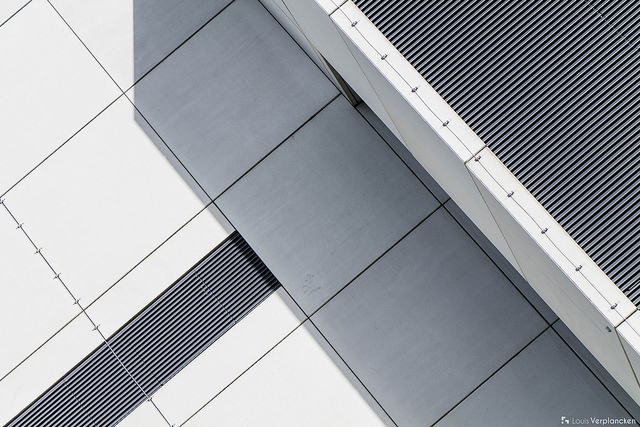 Horizontal lines are used as a device to indicate the horizon, perspective, or to completely upend a viewer’s sense of space altogether! When composing an image, follow each line through with your eyes. Adjusting the integrity of a line later in post-production can be extremely time-consuming. And the success of a minimalist photograph could count on it being exact.
Leading lines reach the perimeter of the physical photograph and provide the viewer with a visual trail to follow into the interior of the image.
Shape in minimalist photography
The compositional elements of line and shape often cross over in a visual plane. For example, the perimeter of a shape can be defined by its outer line, sectioning the interior of the shape off from the background of the image.
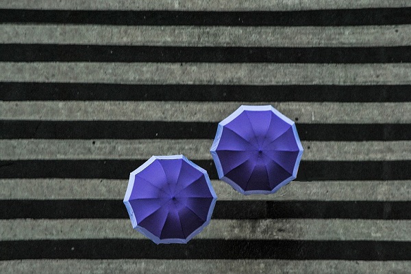
Sharp, inorganic shapes create unrest and action in an image, whereas smooth, organic shapes create a scene of peace, nature, and evenness. The urban environment consists of an inexhaustible array of sharp and smooth lines. Trying to bring the two spectra together creates a dynamic juxtaposition of design and emotion.
Patterns and textures
Pattern and texture lift the image from the page. Texture is the physicality of an image, which engages with an audience by appealing to their sense of touch. Pattern, often combined with texture, adds detail to a photograph, revealing beauty the repetition of otherwise unobserved subject matter.
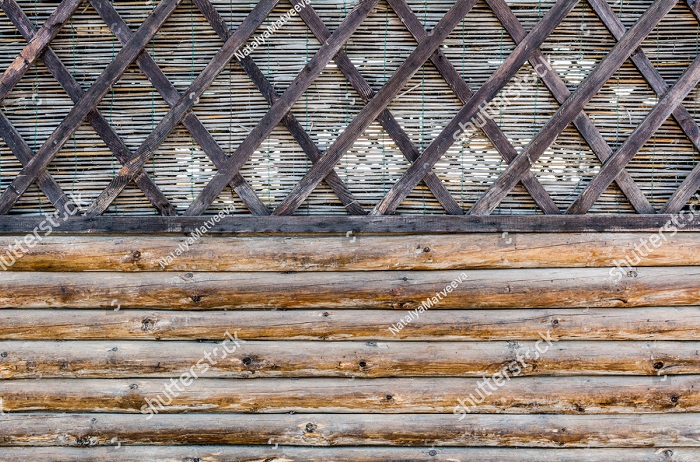
Minimalism and pattern can combine to emphasize size and number, delivering a feeling of sensory overload simply by the repetition of a single design. When limited to concentrated areas in an image, a pattern can serve as a disruption to the remaining landscape or as a contrast to emphasize negative space.
Textural images often depict the wear and tear of the urban environment in delightfully intricate detail.
Negative space
Negative space is what is not there which can be kind of confusing. It lends breathing room to an image. It allows the immediate subject matter to exist with little or no intrusion elsewhere in the frame.
As an example, an image of a single cloud, framed by blue sky neither intrudes nor detracts from the other, but the two exchange meaning nonetheless. The sharp contrast between vacant and overflowing environments means that urban landscapes are great for incorporating negative space into minimalist photography.
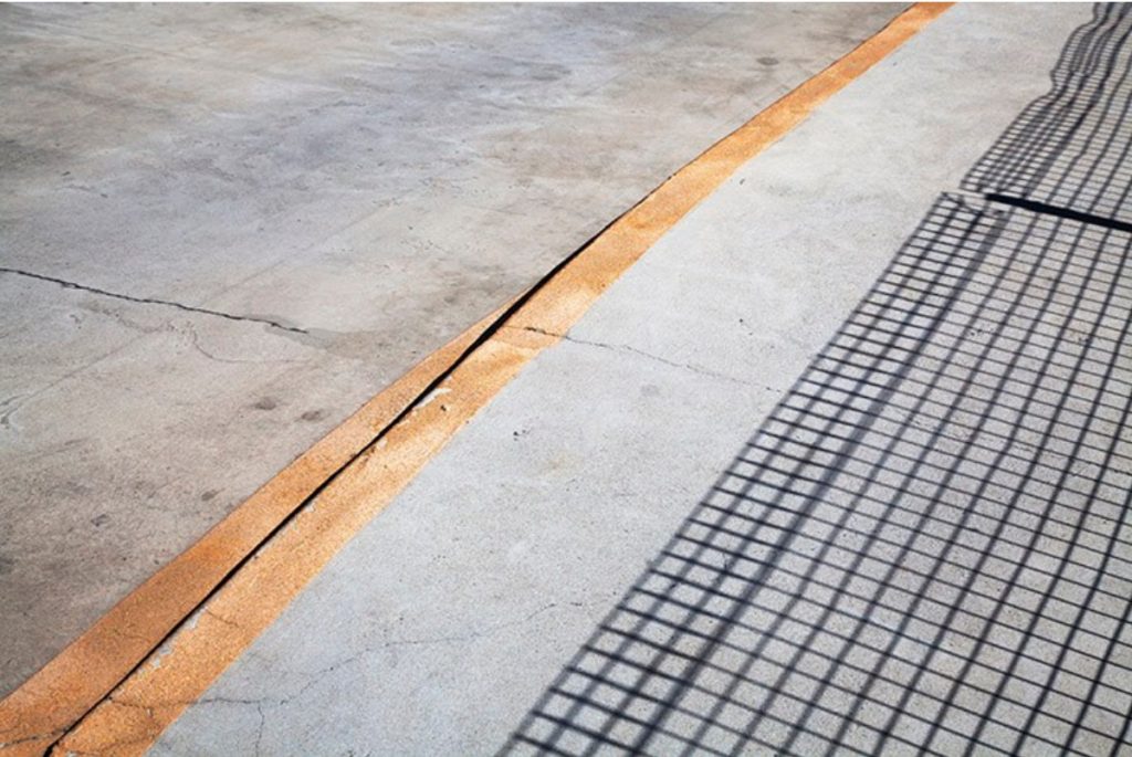
The geometric pattern on the right of this image is offset by the negative space on the left. The relationship balances out the image overall and enhances the bold yellow streak down the middle.
 Conclusion
Minimalism has seen a considerable resurgence in recent years, especially in interior design and photography. A wealth of online curatorship means that tags like #minimal and #minimal_perfection unearth fresh, reductionist imagery by the second. Although the overwhelming volume of images may seem contrary to the principals of minimalism itself, the evolution of the modern landscape continues to create a wealth of opportunity for photographic artists looking to branch out or hone their skills in composition.
How do you use minimalist photography with your images? Please share in the comments below.
A Post By: Megan Kennedy
See also: Settings for night photography
