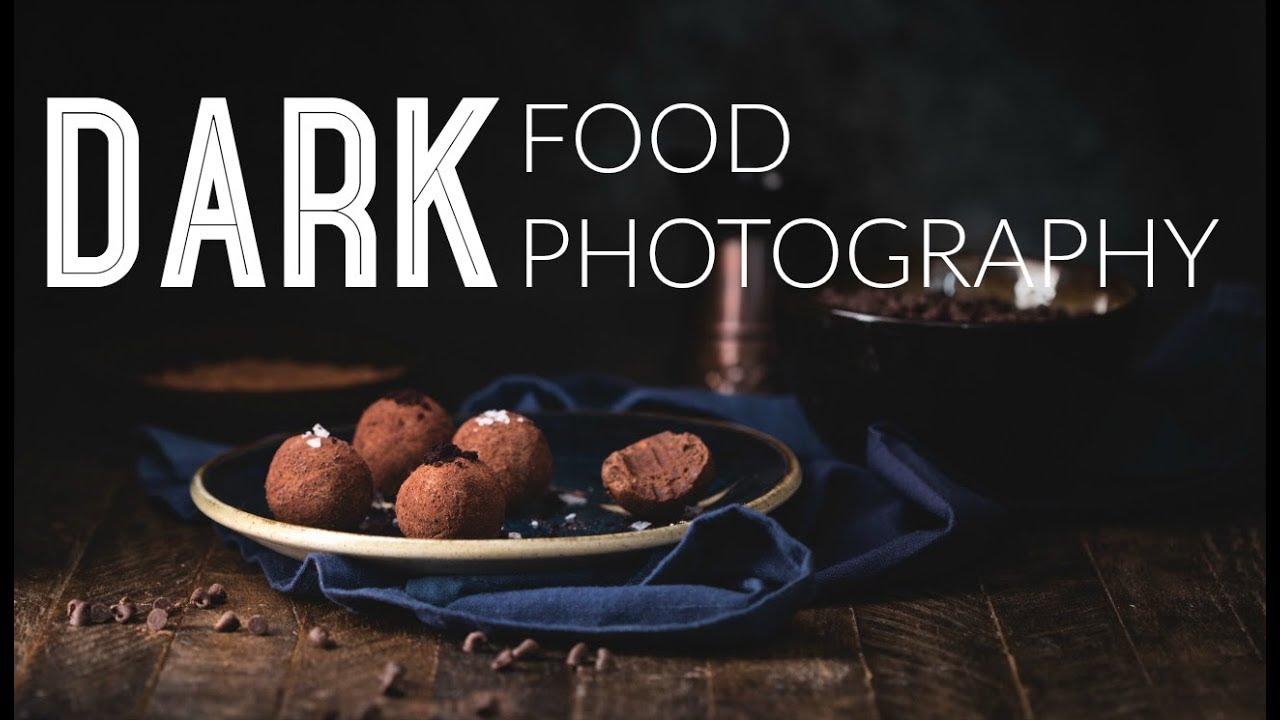
Five Essentials of Doing Dark Food Photography.
Over the last several years, several identifiable trends have developed in the world of food photography, including one towards dark, moody images, often with a rustic feel. These photographs call to mind the interplay of light and shadow in the paintings of the Old Masters, such as those by Vermeer and Rembrandt.
The style is often referred to «chiaroscuro» photography, a painting term borrowed from the art world. It means 1light-dark» and refers to the contrast between the shadows and light in an image. The technique guides the viewer’s eye to a specific area in the frame and creates a dramatic mood. Mystic Light is another phrase used to describe this dark and moody style.
However, a dark style won’t necessarily suit every image. Sometimes a dark, shadowy approach is not appropriate to your subject. Developing strong food photography requires thinking about the purpose of your image. Your lighting, props, styling, and camera settings all work together in service of the story you are trying to convey.
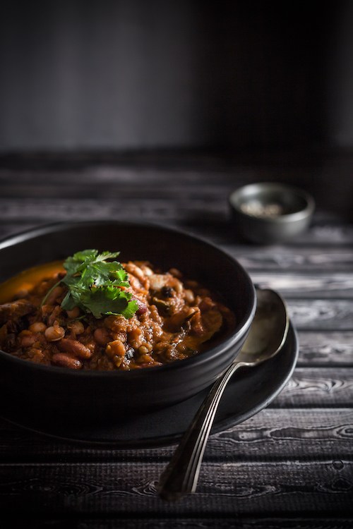
For example, in the image above, I imagined someone sitting down at a farmhouse to eat a bowl of chilli on a cold winter’s day. I envisioned that the light was spilling in from a window onto my scene. This food story is one that I often use in my work, in one form or another, and chiaroscuro is the perfect style to bring it to life, as it arouses the emotions of the viewer.
So let’s take a closer look at how you can apply the chiaroscuro style to your food photography.
Dark Props and Backgrounds
The idea in dark food photography is to keep the background in shadow and draw the viewer’s attention to the main subject—what in food photography we call the «hero». Therefore, a selection of dark or muted props, surfaces, and backgrounds is vital. White or light dishes and props will draw the eye away from the food and create too much contrast, which is distracting and can also be difficult to expose correctly.
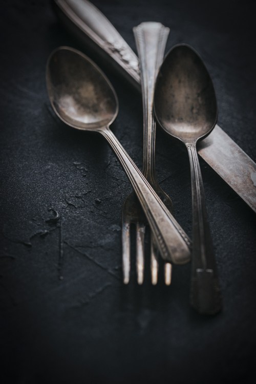
When sourcing props, look for vintage utensils with a patina, which will not reflect the light as much as new ones. Matte dishes will also be less reflective, and are best in darker, neutral tones. Reflections can be hard to manage and cause a lot of problems in food photography.
Some good places to look for these items are thrift shops and vintage or flea markets, where you can find them for a fraction of the price you would pay for them new. Many food photographers use old, mottled cookie sheets in their work, which create a stunning surface or background, which subtly reflects the light without being to bright.
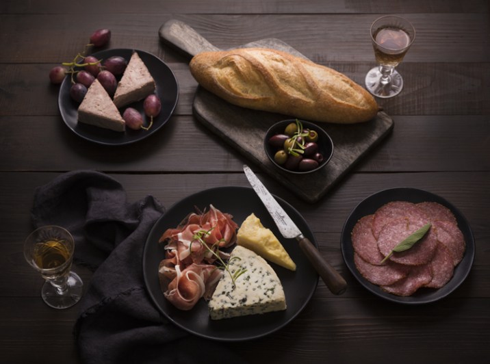
Wood is also a great material to utilize, both in the background and as props. It is easy to work with and lends a rustic feel. You can use weathered items such as an old cabinet door or tabletop. Ensure that whichever wood you use isn’t too warm toned. It will look quite orange in the final images and therefore unflattering to the food. A deep espresso color always looks great.
Food Styling
You will most often find the dark food photography style in editorial as opposed to advertising work. Advertising photography is meant to look perfect, with highly stylized food. Anyone who has ever seen a fast food burger ad and compared it to a real burger knows what I’m talking about.
But editorial food photography, such as that found in cookbooks and foodie magazines, has a looser, more candid style. The food is often perfectly imperfect, with scattered crumbs or artfully placed smears and drips, as if it has been freshly prepared or someone has just begun to tuck in.
This is not to say there is no deliberate effort in the styling because there is. The line between rustic and real and downright sloppy is a fine one. It takes a practiced hand to make food styling look casual and random.
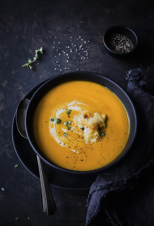
In the image of carrot ginger soup above, I gently swirled cream on the surface and carefully placed the croutons off-center to create a focal point. I garnished it with pepper and thyme leaves, which I also scattered on my surface with a thought to the composition.
In reality, one’s dinner table would hardly look like this, but for the purposes of food photography, such extra touches give an honest, storytelling quality and enhance the main subject, which in this case is the soup.
When approaching styling, think about the ingredients used in the recipe you are shooting. Ask yourself how you can incorporate some of them into your image in a way that makes sense and complements your hero.
Carving the Light
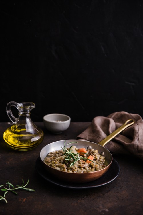
When producing darker images, it is imperative to carve and shape the light to bring attention to your main subject. You will need to determine how you want to light your image and where you want the shadows to fall. For moody images, I often use side and backlighting. My light placement is at about 10:00 if I am imagining the face of an analog clock as my set.
It’s best to use indirect lighting so no lights pointing directly at the set or food. In the case of natural light, placing the surface at an angle to the window.
Use small black reflector cards, like black cardboard or poster board cut into squares, to kick in shadows where you want them, and place them around your set depending on where you want to cut down the light. Alternatively, you can roll up pieces of black poster board and staple the ends together; these rolls can stand on their own and do not need to be propped up against anything.
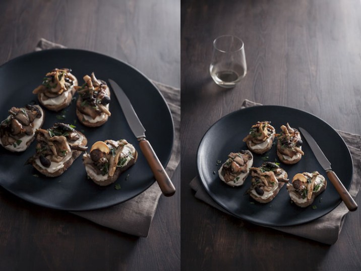
In the images above, I wanted the mushrooms to be bright and catch some of the light, especially as the look was monochromatic, yet I wanted shadows to fall on the plate. I used side backlighting and a black card from the front, angled into my scene to create shadows in the front and absorb some of the light that was coming directly into my scene.
You will have to play around with different sizes and placements of the reflector cards to get the shadows where they work with your story.
Exposure
Typically, with chiaroscuro food photography, you want to slightly underexpose the image in the camera. Chiaroscuro can have very bright treatment of food with very deep shadows, or the image can be low key with not a lot of contrast. Whichever approach you choose, the main subjects should be placed in the brightest part of the frame, which attracts the eye first. Make sure the highlights are not blown out and the shadows are not too black with no detail.
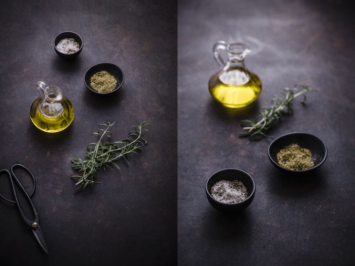
It is best to work with a tripod, especially if you are shooting in natural light in less than ideal conditions. Instead of boosting the ISO and risking a high amount of noise, you can increase the exposure time when using a tripod. As long as you have some light, a long exposure allows you to take a properly exposed picture.
Using the timer or a remote shutter trigger will prevent camera shake and an image that is less than sharp. The focus should be on the main subject, however, the image needs to be exposed for the concept, mood, and story.
Post-Processing
The right post-processing for dark food photography will really make your image pop.
Using the luminance sliders in Lightroom or Camera RAW to brighten colors individually. Use global and local adjustments to bring out the best in the food, instead of bumping up the exposure in the whole image, which can cause your shadows to fall flat.
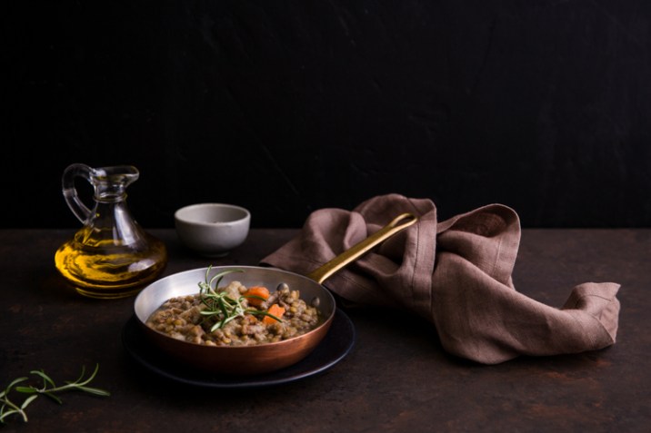
And remember, warm colors bring elements forward, whereas cool colors recede. The best food photography has a balance of both, as it gives a three-dimensional feel to your image. With chiaroscuro food photography, white balance and tint can be used creatively, since you are not using white dishes and backgrounds. Split-toning can also be used to great effect, as long as it is done with subtlety.
Finally, no matter how you carve the light, a bit of a vignette adds a bit more mystery. It also prevents the eye from wandering out of the frame by bringing you back to the brightest part of the image — the food.
Conclusion
So there you have it, my top tips for making dark and moody food photography images!
I’d love to hear if you’ve had a chance to experiment with this approach to food photography. What were your struggles? Please share your experience and images in the comments below.
A Post By: Darina Kopcok
