Image Composition – Basics of Photography
What is the composition of the image? Experts in the field of photography say that the correct location of objects in the frame affects the perception of our photo as a whole. Simple and everyday objects, thanks to the knowledge of several rules of composition, can be shown in an unusual way that will attract the viewer.
At first, remembering all of this may seem too problematic, but you have to trust me – after a while you will start to use the rules unconsciously.
Image composition
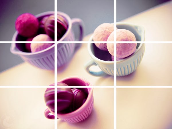
1. Less is more. Rule of thirds – the picture should be divided into four lines (see Figure below) into 9 equal parts, and then the object to be photographed should be placed at one of the intersections, which are considered the strengths of the frame. Thanks to this, we increase the dynamics of photography, which automatically seems more interesting.
The proof of the theory can be found in the pictures below, please rate:


2. Placing an object in the center — a common mistake by novice photographers — is to place everything in the center of the frame. In 90% of cases it is better to follow the rule of thirds, but what about the remaining 10%? The central layout works well when photographing symmetrical objects that balance the composition and highlight what we want to show.
Examples of photos with a central layout:

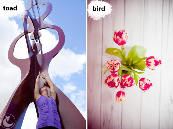
3. Perspective. Frog and bird’s perspective – in recent years, very popular on Instagram. Frog perspective is a view of a certain object from a low point of view. As a result, the viewer has a perception that he is observing an object like being almost at ground level (or frog level).
Opposite of the frog perspective, there is a view of the object for a bird’s flight perspective: with this perspective view, the object of photographing is depicted from a remote point from above.
The use of frog perspective became widespread in Europe in the period 1918-1945 in the style of avant-gardism, modern photography, or simply modernism. This is nonsense!
I do not recommend using the frog perspective in portrait photography.

What picture attracts you more?
4. Linear perspective (two dimensions) – as long as we live in the world of two-dimensional photography, you should move your ass and try a different approach to simple photographs, give them a third, lost dimension, or say differently give depth.
I know two ways:
Add a border – which can be anything! Gates, windows, branches, frame – use your imagination. Ideally, if the frame corresponds to the theme of the photo, it interacts with the main theme and does not repel the viewer. If you decide to enter the border, I recommend setting the shutter to the minimum or close it as much as possible – the frame will be soft, blurred or very clear, as the main theme of the photo. In this photo, the branches are the branches of trees, making them flat from a flat photo.

Volumetric composition is the placement of photographed objects at different distances from the lens. We get the impression of space and multidimensionality. That’s all! Whether all objects will be in the focus area, or you decide to display, for example, only the first plan – choose yourself.
The coils are installed at different distances from the camera, the first and third plan are out of focus, thanks to which we perceive the images as spatial:

5. Format – vertically or horizontally. There is a simple rule of camera regulation: if the subject of the image is an elongated object that is parallel to the horizon line – select a horizontal frame, if you photograph an object located across the horizon line – a vertical frame. Thanks to this you will avoid empty space on the sides. Excess white space in the picture to the right distracts the eyes:

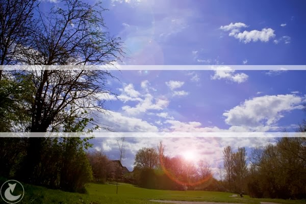
6. The horizon line is important, especially in architectural and landscape photography, it determines the position of the vehicle <-> of the photographed objects <-> of space. If the most important element of the image is the sky, let it take about 2/3 of the frame, if the main object is on earth, let the proportions change. In both cases, the horizon line is at two strong points. Image composition will be saved!

In October 2018, I sent my photos on the First Photo Channel to participate in a portfolio review with Michaelle Speranskaya. To be honest, during the shooting I do not follow the rules, I have all the objects intuitively. I do not spend time on the visualization of intersecting lines, just take off until I get the picture originated in my head.
When parsing the first photo, Michaela talked about how well the objects were located in the frame, about the harmony of colors, lines and so on. But I did not do any of the above, the world around me and the confluence of circumstances did everything for me. I just saw the beauty that came about and took a picture. The video is available here.
I hope that the above examples, supported by photos, will allow you to understand how the composition works. These are not universal principles, they are not in such photos, but their knowledge will certainly not give you a headache. Since you have gone through all of the above, you can consciously start breaking the rules :)
Read also: How to take pictures on Android
